Design System Vs Component Library: Key Differences
Senior engineers building AI-native software for clients worldwide
Understand design system vs component library in practical terms: scope, governance, costs, and when each approach fits a growing product team.
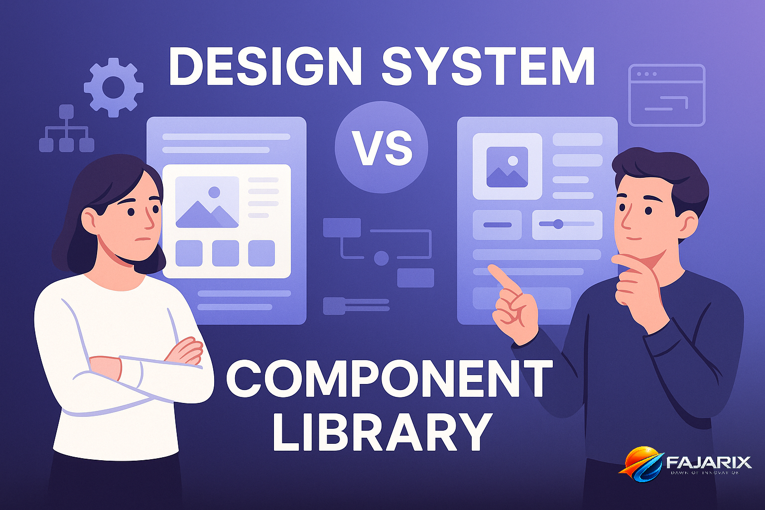
Design system vs component library is the difference between a full product design-and-build operating model and a reusable set of coded UI parts. A component library gives teams buttons, inputs, cards, and patterns to ship faster. A design system goes further: it defines standards, governance, accessibility, tokens, documentation, and decision-making across products.
For a CTO or founder, this is not a naming debate. It affects delivery speed, hiring, product consistency, accessibility risk, and how expensive every new feature becomes after your first release. We have seen teams assume they had a design system because they had a Storybook instance with 30 components. Six months later, they were still arguing over spacing, form behavior, and mobile variants in every sprint.
If you are choosing the right foundation for a product portfolio, the practical question is simple: do you need reusable code, or do you need a shared product language with governance? That is the real decision inside design system vs component library.
What Is the Difference Between Design System Vs Component Library?
A component library is a collection of reusable UI components implemented in code. A design system includes that library, but also design tokens, usage rules, accessibility standards, content guidance, documentation, contribution workflows, versioning, and ownership.
Think of it this way: a component library answers, “What can developers reuse?” A design system answers, “How should the entire organization design and build interfaces consistently?”
| Area | Component Library | Design System |
|---|---|---|
| Primary Goal | Reuse code | Standardize product decisions |
| Typical Contents | Buttons, forms, modals, tables | Components, tokens, patterns, rules, docs, governance |
| Owners | Usually engineering | Design + engineering + product |
| Tooling | Storybook, React, Vue | Figma, Storybook, token pipelines, docs, review workflows |
| Scope | UI implementation | UI, UX, accessibility, brand, content, process |
| Governance | Often informal | Explicit contribution and approval model |
| Business Impact | Faster front-end delivery | Lower product entropy across teams and channels |
In practice, most teams start with a component library and later discover they need a system. That transition usually happens when they add a second product, a mobile app, multiple squads, or stricter compliance requirements.
When Is a Component Library Enough?
A component library is enough when your team is small, your product surface is narrow, and the cost of inconsistency is still low. If one squad ships one web app and the same three engineers review most UI code, a lightweight library can be the right choice.
Good Fit Scenarios
- An early-stage SaaS product with 1 to 2 front-end engineers
- A startup validating an MVP before investing in broader UX governance
- An internal dashboard where branding and cross-platform consistency matter less
- A single-platform web product with limited accessibility or localization complexity
In these cases, a component library built with React, Tailwind CSS, MUI, Chakra UI, or Radix UI can create immediate leverage. You can standardize forms, reduce duplicate code, and improve release speed without creating a formal operating model around design.
But there is a limit. Once teams start creating “just one custom variant” every sprint, your library stops being a force multiplier and becomes a drawer of inconsistent parts.
When Do You Need a Design System Instead of a Component Library?
You need a design system when inconsistency starts costing more than governance. The trigger is usually organizational, not visual: more teams, more products, more channels, more compliance, or more customer-facing complexity.
Signals You Have Outgrown a Library
- Design reviews keep revisiting the same basics like spacing, hierarchy, states, and form behavior.
- Developers rebuild similar components because the existing ones do not encode enough rules.
- Figma and production diverge, creating handoff friction and QA churn.
- Accessibility defects recur across products because standards are not centralized.
- Brand consistency breaks between web, mobile, marketing, and product surfaces.
- Onboarding takes too long because new hires learn tribal knowledge instead of documented standards.
This is where design system vs component library becomes a business decision. A system reduces decision overhead. Instead of debating every dropdown, teams align on tokens, states, interaction rules, and contribution standards once, then reuse them across releases.
How Does Governance Change Design System Vs Component Library?
Governance is the biggest difference. A component library can survive with a few maintainers. A design system needs ownership, change control, documentation standards, and a clear path for teams to request, approve, and version updates.
Without governance, a “design system” is usually just a component library with a better slide deck. The hard part is not creating components. The hard part is deciding who can change them, how breaking changes are managed, and how exceptions are handled.
What Good Governance Looks Like
- Named ownership: usually one design lead and one engineering lead
- Contribution model: propose, review, approve, release
- Versioning policy: semantic versioning and migration notes
- Documentation: usage, accessibility, dos and don’ts, edge cases
- Adoption metrics: coverage, duplicate component rate, UI defect rate
Teams often underestimate this. Building 40 components may take 6 to 10 weeks. Running them well over 12 months is the real investment. Tools help, but governance is what keeps the system alive.
If nobody owns exceptions, exceptions become the system.
Is Design System Vs Component Library Worth It for Startups?
Yes, but not in the same way. Startups rarely need a full design system on day one, but they do need to avoid accidental entropy. The right move is usually a staged approach: start with a disciplined component library, then formalize it into a system when product and team complexity justify the cost.
For most startups, we recommend three maturity levels rather than a binary choice in design system vs component library.
A Practical Maturity Model
Level 1: Starter Library. Core components, basic tokens, and a few coded patterns. Enough for an MVP or first product release.
Level 2: Structured Library. Shared tokens, documented usage, accessibility checks, and design files aligned with code. Good for growing SaaS teams.
Level 3: Full Design System. Multi-product governance, contribution workflows, release management, content guidance, and cross-platform standards.
For founders, this creates a clearer budget decision. You do not need to fund a full system too early. You do need to avoid shipping an inconsistent product that becomes expensive to clean up after product-market fit.
Fajarix Perspective: Where Teams Waste Money
At Fajarix, the most common mistake we see is teams investing in visible artifacts instead of operational leverage. They pay for polished component screenshots in Figma and a nice Storybook, but skip tokens, naming conventions, state models, and accessibility behavior. The result looks mature in demos and breaks down under delivery pressure.
In one recurring pattern, a company with 2 product designers and 5 engineers builds 25 to 40 components for a new SaaS dashboard. That feels complete. But because there are no semantic tokens for spacing, color, elevation, and typography, every product team still makes local decisions. Six months later, there are four button sizes, inconsistent empty states, and duplicated table logic across repos.
The expensive part is not the first build. The expensive part is the hidden tax on every future sprint. We have seen this add 15% to 30% more front-end effort on feature work once a product crosses multiple modules and teams. That is why our product engineering engagements usually treat system maturity as an architecture decision, not a design deliverable.
What We Recommend Instead
- Define design tokens before expanding component count
- Standardize states: hover, focus, error, loading, disabled, empty
- Document where components should not be used
- Measure adoption and duplicates before building more primitives
- Align design and code naming early to reduce translation errors
Distributed teams often feel the pain of design system vs component library earlier than co-located teams. In that setup, undocumented UI decisions create more friction because fewer decisions happen synchronously.
The gain is not abstract. It reduces review loops, cuts ambiguity in tickets, and lowers handoff dependence on a single senior designer or front-end lead.
This matters even more in regulated domains like FinTech software and products with complex onboarding, permissions, or data tables. In those environments, consistency is tied to trust and error prevention, not just aesthetics. A system gives teams a repeatable way to encode those rules across web and mobile surfaces.
What Should Be Included in a Real Design System?
A real design system includes more than reusable UI. If these elements are missing, you probably have a library, not a system.
Minimum Viable Design System Contents
- Design tokens for color, typography, spacing, radius, shadows, motion
- Core components with all states and accessibility behavior
- Patterns such as forms, search, filtering, navigation, empty states, and tables
- Content guidelines for labels, validation, helper text, and microcopy
- Accessibility standards including keyboard behavior and contrast rules
- Documentation for usage, edge cases, and implementation notes
- Governance for contribution, approval, deprecation, and release management
If your team is investing in scalable UI/UX design systems, these are the assets that create compounding returns. Without them, every squad still invents too much of the product experience locally.
How Should You Decide Between a Design System and a Component Library?
Use business complexity, not aspiration, as the decision framework. Many teams choose based on what sounds more mature. That is the wrong test. Choose based on how many products, teams, platforms, and compliance constraints you actually have in the next 12 to 18 months.
A Simple Decision Framework
| If Your Situation Looks Like This | Choose This |
|---|---|
| One product, one squad, early validation stage | Component library |
| One product growing quickly, repeated UX debt | Structured library with tokens and docs |
| Multiple squads or multiple products | Design system |
| Web + mobile + marketing consistency needed | Design system |
| Regulated or accessibility-sensitive workflows | Design system |
If you are unsure, do not ask, “Do we want a design system?” Ask these instead:
- How many teams will ship UI in the next year?
- How often do we repeat design decisions?
- How costly are inconsistencies to trust, conversion, or compliance?
- Can we name an owner for standards and releases?
- Will this need to scale across web, mobile, or white-labeled products?
Those answers usually make the path obvious.
Common Misconceptions About Design System Vs Component Library
Several misconceptions cause teams to overbuild or underinvest.
“A Design System Is Just a Bigger Component Library”
Not quite. Size is not the defining trait. Governance and decision rules are. A 15-component system with strong tokens, patterns, and ownership can be more valuable than a 70-component library with no standards.
“We Can Add Governance Later”
You can, but the migration cost rises quickly. Once teams create local variants in production, standardizing them becomes political as well as technical.
“Only Large Enterprises Need Design Systems”
False. Small teams with high growth, multiple product lines, or distributed delivery can benefit earlier than large but stable organizations.
“Using MUI or Ant Design Means We Already Have a Design System”
No. You have a third-party UI framework. It may accelerate delivery, but it does not automatically define your product’s patterns, content rules, governance, or brand behavior.
Recommended Starting Stack and Timeline
For most teams, the fastest practical path is to start lean and add rigor where it pays back quickly.
Typical Stack
Figmafor component and pattern designStorybookfor coded component documentationStyle Dictionaryor token tooling for multi-platform design tokensReact,Vue, orFlutterdepending on product stackChromaticor visual regression tooling for UI change control
Typical Timeline
2-4 weeks: audit current UI, define tokens, identify core components.
4-8 weeks: build starter library, document usage, align design and code.
8-16 weeks: add patterns, accessibility standards, contribution workflow, and release process.
That timeline assumes focused ownership. If no one owns the system, even the best stack will drift.
For teams scaling delivery quickly, staff augmentation can be a practical way to add front-end system expertise without slowing roadmap commitments.
The Bottom Line on Design System Vs Component Library
The right answer to design system vs component library depends on how much organizational consistency you need, not how polished your UI looks today. A component library helps teams reuse code. A design system helps organizations make repeatable product decisions at scale.
If you are early, start with a disciplined library and explicit tokens. If you are growing across teams, products, or platforms, invest in a real system with governance. The sooner you recognize which stage you are in, the less UI debt you carry into growth.
Ready to put these insights into practice? The team at Fajarix builds exactly these solutions. Book a free consultation to discuss your project.
Ready to build something like this?
Talk to Fajarix →